Kaens Poster

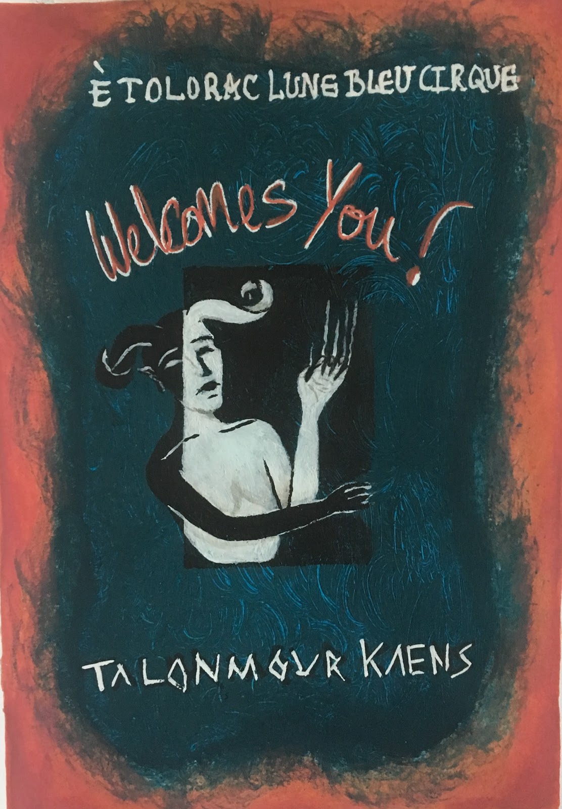
This poster idea came to me when i was going sleep. I quickly sketched out the basic idea in my book on my bedside in the dark. Originally the idea was that the side of the body outside of the black box would be in normal colour, painted like the gouache experiments. However, i changed it to black and white as i have considered painting Kaen in these colours before for a leathery look. I also thought the line down the middle where it changes would look more effective. In my mind i pictured the dark blue, black n white and a bright orange somewhere. I think these colour influences came from Coraline in the other worlds.
 For instance vibrant colours matched with dark colours were used throughout to create a distracting trap for the children.
 I painted a lighter blue layer first, then went over the top with the darker blue, using a rough paint bush that left scratches showing the lighter blue under. For this effect i painted in circular motions to create swirls in the blue. These little lines represent snakes, i thought i could include little details in the background for each character instead of making them blatantly obvious. Similar to Coraline where the wallpaper in the real house has details of insects all over, hinting to the Beldelm eating insects. I think next time i paint these i need to do them bigger so they are more prominent in the background. I then painted in the black box that Kaens peels back on the right. I realised that it doesnt make
 sense that Kaens arm is white and then looked back to the first sketch realising my mistake. Kaen comes out of the box to peel it back. So i went over Kaens arm in black and the white worked out as an outline so it doesnt blend into the background. I added features using the opposite colour for each side and added a little light brown to the white for shading on the arm and hand. Im quite pleased with this outcome and i think the idea works well. I just cant figure out where a snake could go if i do decided to add it in.
I used a white pen to add the words, the top font is slightly out of the centre. Additionally, i did a different font for Kaen name as i felt the straight lines in the words match the scratches as if Kaen clawed them in. Also usign a dark pen to create a shadow behind the white.

 I felt the image was too dark all together and wanted to add a bright orange into it. At first i wanted to make the scratches orange so they stand out. Instead i decided to create a straight edge for the poster as i felt it would work better, additionally creating an outside border. The orange definitely works to grab someones attention and i think it looks rusty which compliments the scratchy blue. I then decided to also add orange to "Welcomes You!" so the invite stands out. Therefore i felt that adding orange to the scratch marks would be too much.
I think to improve i would need to do the orange layer first so the blue edge can fade out on top instead of being covered by the orange. If i had decided to paint the black side of Kaens like the gouache study i think it would not have worked as it would not have looked as effective and too distracting with everything else going on in the poster.


Comments
Post a Comment