Posts

Final Piece and Evaluation

Image
   I woke up at 6am to set up my final major throughout my house before it rains later. The day was grey and foggy which i felt suit the dreary end of the posters and circus tent.    I took the fairy lights outside to test if there was any use for them during the day, unfortunately i think they add nothing during the day and due to the bad weather wouldnt be able to leave my work up to see how it look during the night. If i had used other materials i would have been more confident to leave them to the bad weather and let them get destroyed, but i knew the rain would just destroy the paper and remove the PVA glue applied on top, creating an unappealing mess without any effect to aid the dirty appearance. The alternative materials that i would have been confident tto leave to the weather would be if the posters were printed out on poster paper and the tent been made out of cardboard and more sheltered.    Another thing i needed to make a final decision on ...

Refinements of Final Details: Arrows, Flags, Poster Order etc.

Image
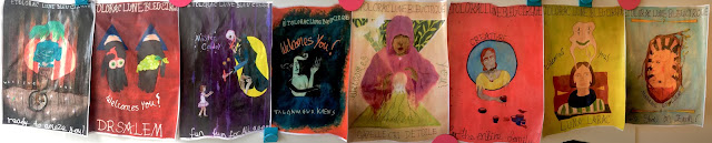
   Panorama of all finished posters lined up together in order. Beginning from right to left to show the process of colourful, eye catching posters to the darker, less detailed. I may swap Gazelle and Luna around as i feel the pink tones between Kaens, Gazelle and Creature need to be broken up, additionally to even out the plain backgrounds to the more detailed one shared between Kaens and Gazelle. Other than that i think it is all quite balanced in colour and the shapes. I repeated the use of shapes to show a connection between the lighter side to the darker. This was also used through colours as i repeated the same colours but made them darker, such as Etoloracs sky blue to Kaens dark blue that begins to invade the orange poster to convey how the posters are changing to reveal the deceit.     Between each poster i will place arrows to help direct people in the right direction, also encouraging them to follow more. I will use cardboard and chose the firs...

Dr Salem Poster

Image
   New official sketch for Salems poster i think works well with the triangle shapes. I added pencil lines again to mark out where the writing will go, this time the message will be in a semi circle under the hands as open palms that are offering you something is very inviting despite if it is dangerous.    Again i used this piece of scrap paper for colour swatches whilst mixing before actually using them on the poster. I used these two pieces for Creatures and Salems poster. The tissue again to clean or dry my brush when blending etc.    For the background i mixed red, dark brown and some black gouache paint to create a drying blood appearance, I painted it across the page to create lines in the paint to appear patchy and marked as if darker sections are drying compared to the lighter sections. I think this colour works quite well for the darker sides of the poster, it works well with the browns used in Weeping Souls poster whilst being the darke...