Proposal
 I decided to combine two aspects of my studies from this year,
1950’s illustration and Divinatory. I have been inspired by 1950’s style of advertisements,
shop signs and gift shops due to my interest in fashion from the era. I
collected postcards and a vintage magazine for reference and began looking at
Rene Gruau, an Italian fashion illustrator who caught my eye due to his bold
lines and controlled block of colours.
I decided to combine two aspects of my studies from this year,
1950’s illustration and Divinatory. I have been inspired by 1950’s style of advertisements,
shop signs and gift shops due to my interest in fashion from the era. I
collected postcards and a vintage magazine for reference and began looking at
Rene Gruau, an Italian fashion illustrator who caught my eye due to his bold
lines and controlled block of colours. [1] Gruau took his influence from Japanese
art and Kabuki theatre, a form of performance that is not unlike a circus.
Thinking about how I wanted to develop my painting and the 1950’s shop signs I
decided I could paint “Freakshow” posters. Furthermore, by combining this with
my interest in Divinatory, I wanted to incorporate a “Witch” aesthetic. [2]
[1] Gruau took his influence from Japanese
art and Kabuki theatre, a form of performance that is not unlike a circus.
Thinking about how I wanted to develop my painting and the 1950’s shop signs I
decided I could paint “Freakshow” posters. Furthermore, by combining this with
my interest in Divinatory, I wanted to incorporate a “Witch” aesthetic. [2] I
collected some tarot cards designed by Natalee Miller who draws on themes of
mysticism and divine femininity. Her influences come from the 1980’s and 1990’s
nostalgia, Art Nouveau and Art Deco. I originally chose the Amenti Oracle
Feather Heart deck due to her vibrant designs [3]. Throughout this project, I
intend to select three cards from the deck to not only inspire me by their designs
but to see what the cards tell me
to influence my work.
I
collected some tarot cards designed by Natalee Miller who draws on themes of
mysticism and divine femininity. Her influences come from the 1980’s and 1990’s
nostalgia, Art Nouveau and Art Deco. I originally chose the Amenti Oracle
Feather Heart deck due to her vibrant designs [3]. Throughout this project, I
intend to select three cards from the deck to not only inspire me by their designs
but to see what the cards tell me
to influence my work.
[4]
I aim to investigate the visual designs of Tv
shows and film such as American Horror Story (2011-) primarily focusing on
season four: Freakshow and The Greatest Showman (2017), also looking into the themes and colour schemes of the film Coraline. I will also research
into documentaries, such as Freakshow (2013) and The Brownski Affair [5]. More specifically relating to
poster design and advertising, I aim to find examples from the 1950’s or
Victorian era as they will be more stylistic and possibly creepy, helping to
fuel my ideas. Additionally, I could look at a modern circus called Cirque Du
Soleil. Another area of research I could explore would be to design my own acts
for the posters. Starting with Witches. I’ve recently been to Knaresborough and
explored the forest where Mother Shipton, a famous fore teller, lived.
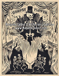 I discovered another
artist, known by Madam Talbot. She creates hand-made bibelots, arcane monstrances,
framed curios, mourning dolls, dark objet d'Art and hand-Illustrated pen-and-ink
poster prints. Talbots posters caught my attention when searching for Freakshow
posters. Despite lack of colour, the illustrations themselves are so intriguing
with unique focuses and details. I can use her work as reference to how to
frame and layout the writing in my poster designs. [6]
I discovered another
artist, known by Madam Talbot. She creates hand-made bibelots, arcane monstrances,
framed curios, mourning dolls, dark objet d'Art and hand-Illustrated pen-and-ink
poster prints. Talbots posters caught my attention when searching for Freakshow
posters. Despite lack of colour, the illustrations themselves are so intriguing
with unique focuses and details. I can use her work as reference to how to
frame and layout the writing in my poster designs. [6]
For my project I would
like to paint a few posters of performers that i have created, influenced by the 1950’s
illustration style, inviting people to come to the circus. I want the messages on the
posters to be incredibly welcoming and open to everyone. Therefore, will title
my project as “You’re ALL invited!”. If allowed out I
would have hung these posters in public spaces directing people to the studio,
promising a fun time. Also, collaborating on the environment with Mae, creating
a circus tent that my posters hang outside, inviting you in to watch Mae’s
animation. However due to college closure this is impossible, so I will use my
original idea. Instead I can place them throughout my house and garden. The
posters and small arrow signs bring the follower to a small circus tent under
15cm. Impossible for any person to enter or see into, thus show deception and
lies from the posters. Conveying false advertisement through media or promises
that a person makes that only applies to a certain group of people, like first
class, despite advertising the promise to everybody. I could include audio of
carnival music and some spotlights to create a professional atmosphere for the
circus tent. I think this project will help me develop my painting skill and
use of colours when painting. Instead of trying to bring together a collection
of mixed media and losing the quality in outcome due to not developing each
skill used. I can focus on just painting and creating the vibrancy through one
medium.
I will use inks and
gouache like the artist Rene Gruau, I enjoy the range that gouache can be used
in with layering and pigment consistency by how watered down the paint is. As well as try oil painting for
the first time to push myself into trying more painting mediums that could be more challenging. I want vibrant rich colours in my paintings and to experiment
with my style from clean block colours most 1950’s illustrations use, to a rougher layered colours with visible brush strokes. I will explore the
possibility of painting on cotton fabric for a poster as the fabric could be
hung easily and move due to a breeze if outside. Or print a copy of my painting out and using PVA glue to achieve a gloss shine like a professional poster. I could also plaster some
posters to a board, fence or outside wall using flour/water paste. Allowing me
to rip edges off to create an authentic old poster appearance. For the tent I
could create the base using card, paint stripes on it then use tissue
paper or fabric to create the pitched bottom of the tent to the floor. These
edges will help create a more natural shape that can be affected by a small
breeze again like the fabric posters. Then some hay and a fake candle light
inside to create an inviting glow to the audience. Last of all, i can use cardboard to cut out some arrows to place between the posters to direct the person towards the tent. I could paint the arrows to appear like wood or a different colour to match the poster or tent. Last of all, if i had extra time i could create small stickers advertising the circus more to place on lampposts and other laces despite not allowed to be open to the public.
The research that i began with into different aspects of my interest took a while, but was definitely helpful to expand my knowledge and ideas for my project to develop much deeper. However, during this time i wish i did some practical work alongside it, for instance having a sketchbook for inspiration where i wrote quotes from resources or kept images and other things that inspired me. I could then combine this with sketches of ideas and colour schemes that came with it. That way i could have this book open as i worked to pick out the bits that i could develop further or integrate into my work. As i did not do this and placed all my work online it was difficult to keep every idea fresh in my mind as i actually began my practical work. I felt more focused in my work during this project as i have been working all foundation year to not get distracted by other ideas that do not exactly tie into my base idea. This helped create a linear narrative in my sketchbook as i developed my ideas, and this translated into the linear order of my posters. I kept focused on the basics from first character sketch ideas, to names and quotes to write on posters and where to place them. Additionally, exploring the border design and how that could develop with the order of the posters, or really become undeveloped.
Another challenge i faced was the material i used to create the tent. It was limited striped tissue paper. I created a small practice piece of the tent and then continued to plan out and measure each step in creating the tent. There are a few flaws mainly visible in the back of the tent on the cone roof but i think these flaws fit into the appearance of the posters where they are dirty and ripped and how everything is fake. Additionally, i do not intent for anyone to actually see the back of the tent, it will either be placed under a bush or between the arch in my garden where no one is supposed to walk behind because the tent blocks the path.
Last of all, i decided not to paint onto cotton material as i had a limited resource again, furthermore i had nowhere to hang it from outside in my garden. I also considered paying to get my paintings printed out properly as posters. I decided against this due to cost and time, it would be too stressful trying to paint everything in a short amount of time to get it sent off and wait for its return before deadline. Instead i found a method where i could print it off onto paper, paint over it int PVA glue to create a finished poster look.
References:
- Gruau official website and collection of work.
- Gruau illustration.
- Amazon site where I bought the deck from. Came with a guide to
explain each card, how to use and about the artist.
- Natalee Miller website, poster.
- IMDB about 2013 Freakshow Tv series centred around family and
the performers.
- Madam Talbot website.


Comments
Post a Comment